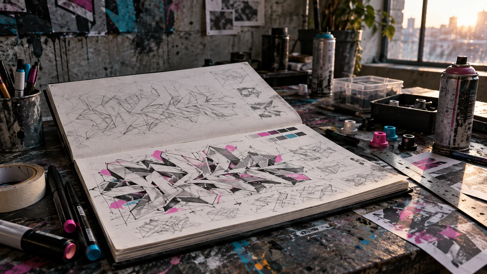
Wildstyle becomes easier to understand when you stop treating it as a pile of arrows and start treating it as a system of letters. The decoration can be dense, but the piece still needs an underlying structure: each character has a skeleton, the bars around that skeleton carry weight, and the spaces between letters determine whether the word reads as one composition or collapses into noise.
This guide focuses on a repeatable drawing process. Work in a sketchbook first, then transfer the design only to a wall or panel where you have clear permission to paint.
1. Start with the letter skeleton
Write the word as a simple monoline tag. That line is the skeleton: the basic route each letter follows from its first stroke to its last. Before adding width, check three things:
- Recognition: can you still identify every letter without color or effects?
- Rhythm: do repeated verticals, bowls, and diagonals feel related?
- Proportion: are one or two letters accidentally dominating the word?
Redraw the skeleton several times. Change only one variable per sketch — slant, width, height, or spacing — so you can see what actually improves the word. A complicated outline cannot rescue a weak skeleton.
2. Build letters from bars
Turn each skeletal stroke into a bar with a consistent thickness. Think of the bar as a strip of material bending through space. At every corner, decide whether the joint is squared, rounded, pinched, or cut. Repeating the same joint logic across the word creates style more reliably than adding unrelated decorations.
Keep counters open: the enclosed spaces inside letters such as A, B, D, O, P, and R. If a counter disappears too early, the letter usually becomes difficult to recover later. It is easier to close a space during refinement than to reopen one after extensions and shadows have been added.
3. Control overlap and hierarchy
Wildstyle letters often interlock, but every overlap needs a front and a back. Choose which letter leads the composition and use a consistent stacking order. Where two bars cross, interrupt the line behind and keep the foreground edge clean. If both outlines continue through the same junction, the intersection reads as an accident.
A practical hierarchy is:
1. primary letter bars,
2. secondary connections between letters,
3. extensions and arrows,
4. outline and keyline,
5. shadow or 3D depth,
6. highlights and small accents.
Do not give all six layers equal contrast. The primary bars should remain the easiest structure to follow.
4. Use negative space as part of the drawing
Negative space is the unpainted or background area between forms. Check it as carefully as the letters. Look for narrow accidental gaps, trapped pockets, and one large empty zone that makes the composition lean to one side.
Turn the sketch upside down or view it as a small thumbnail. At that scale you stop reading the word and start seeing its mass. Aim for a deliberate silhouette with a few breathing spaces rather than dozens of equally small holes.
5. Add connections before arrows
Connections should explain how one letter hands energy to the next. Extend an existing bar, echo a diagonal, or bridge two compatible corners. A connection is strongest when it grows from the letter structure; a loose line placed between letters usually looks added on.
Arrows work the same way. Give each arrow a source, direction, and job. It might continue the baseline, pull the eye back into the word, or balance a heavy terminal. Limit the first sketch to two or three important arrows. If the composition works, smaller directional accents can be added later.
6. Separate fill, outline, and depth
Plan values before choosing exact colors. A reliable three-value system uses:
- a mid-value fill,
- a darker outline,
- either a very dark shadow or a clearly lighter 3D plane.
The outline must separate adjacent bars. The 3D should move in one direction throughout the piece — for example, down and right — with the same projected distance from every edge. Changing direction halfway through breaks the illusion even when the individual shapes look polished.
Use a thin outer keyline only if the piece needs separation from a busy wall. On rough or previously painted surfaces, a high-contrast keyline can do more for readability than another internal effect.
7. Plan color by role
Choose colors according to function rather than collecting as many as possible. One simple palette might include a dark outline, one dominant fill color, one related transition color, and a small high-contrast accent. Reserve the brightest accent for focal points such as selected corners, cuts, or highlights.
Test combinations as small swatches beside the sketch. Colors that look separate on a screen can merge on concrete, at distance, or under flat light. If the piece depends on two similar values, strengthen the outline or simplify the fill pattern.
8. Transfer the sketch in passes
On a permitted wall, mark the overall width, cap height, baseline, and center before outlining individual letters. A loose construction color is easier to correct than a finished outline.
Work in passes:
1. place the word and major letter masses,
2. correct spacing and proportions,
3. lock the primary outline,
4. add fill and internal separation,
5. build the shadow or 3D,
6. add connections, accents, and final cleanup.
Step back frequently. A piece can look controlled from arm's length while its word shape is visibly unbalanced from ten meters away.
Common mistakes
- Decorating before the letters work: solve the skeleton and bars first.
- Using every gap: leave intentional quiet areas so dense sections have contrast.
- Inconsistent depth: pick one projection direction and measure it visually.
- Too many arrow styles: repeat one or two arrow constructions instead of inventing a new one at every corner.
- Equal contrast everywhere: decide what should be read first, second, and third.
- Skipping the thumbnail test: reduce the sketch until only its silhouette and largest gaps remain.
Three focused practice drills
One word, five skeletons
Choose a four- or five-letter word and draw five monoline versions. Change only slant and spacing. Circle the version with the clearest rhythm, then build bars around that one.
Two-layer overlap study
Draw three letters using only black and white. No arrows, color, or 3D. Make every crossing unambiguous. If the stacking order is unclear, simplify the intersection.
Single-direction depth
Draw one block letter and project every visible edge down and right by the same distance. Repeat with a curved letter. This isolates the depth problem before it is buried inside a full piece.
Wildstyle is not complexity for its own sake. The strongest pieces make many decisions feel connected: the skeleton supports the bars, the bars create useful gaps, the connections reinforce movement, and the color helps the viewer navigate the result. Build that system in stages, and complexity becomes something you control rather than something you add.